Coin Parliament
UX and information design for a vote-to-earn social indicator platform — where users generate public signals through collective voting. The work centered on trust, clarity, and scalable interaction patterns across mobile and web.
A platform where trust is the product — and bad UX breaks it.
Coin Parliament is a vote-to-earn platform where users cast votes to generate public signals — essentially collective sentiment indicators that become visible data points in a shared system. The value proposition depends entirely on users trusting that the signals they're contributing to are meaningful, un-gamed, and correctly interpreted.
Vote-based systems are fragile from a UX perspective. Users need to understand what they're voting on, what the resulting signal means, and why the system is credible enough to act on. Any ambiguity in those three areas breaks the loop — users either don't vote, vote incorrectly, or discount the signal output entirely.
The design challenge was to build participation and interpretation flows that remained legible and trustworthy across both mobile and web, without creating the visual complexity that would undermine the trust it was trying to build.
My role
UX / UI Designer — responsible for information architecture, interaction patterns, trust signal design, and cross-platform consistency.
Platforms
Mobile (primary) + Web — with consistent IA and interaction language across both.
Core design challenge
Making collective voting feel credible, comprehensible, and worth participating in — for first-time and returning users alike.
If users can't read the signal, the signal has no value.
The platform's entire value proposition is the signal — the public indicator generated by collective voting. But signals are only useful if users can interpret them accurately and quickly. Present them wrong and users either misread them, ignore them, or stop contributing to the system that produces them.
The design had to answer three questions simultaneously: What am I voting on? What does my vote contribute to? What does the resulting signal mean? Separating and sequencing those answers was the core UX problem.
- Trust and integrity — The design had to reduce ambiguity and visually discourage manipulation behaviors without making the system feel adversarial.
- Signal comprehension — Outputs must be interpretable at a glance, not abstract. Users shouldn't have to work to understand what a signal means.
- Cross-platform consistency — The interaction patterns and trust signals had to hold across mobile and web. Inconsistency would undermine credibility.
- Low cognitive load — Users act quickly; the voting interface had to prevent misreads without requiring deliberation on every action.
How the system was designed to build and preserve trust
Every design decision was traceable to one principle: the system should be impossible to misread, and difficult to misuse.
- Explicit hierarchy between voting and signal interpretation. The voting flow and the signal output were visually separated — users always knew which mode they were in. "What am I voting on?" and "What does this signal mean?" never competed for attention.
- Standardized status language across all surfaces. Every state — pending vote, active signal, expired signal, invalidated signal — had a single consistent name and visual treatment. No synonyms, no improvised labels per surface.
- Predictable, low-novelty interactions. Familiarity was a trust signal. Unusual interaction patterns — however clever — were rejected in favor of patterns users could execute without thinking. Reduced novelty reduced hesitation.
- Readable metrics designed for scanning and comparison. Signal outputs were formatted for fast comparison across multiple items — not optimized for single-item depth. Users needed to compare signals, not study one in isolation.
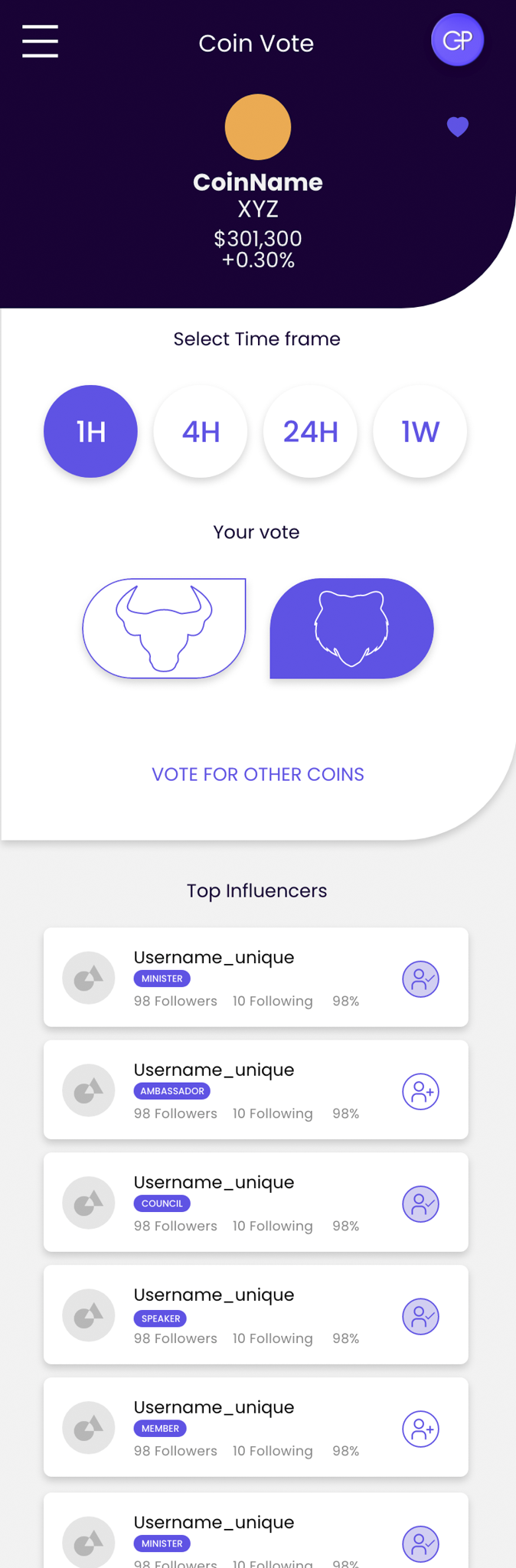
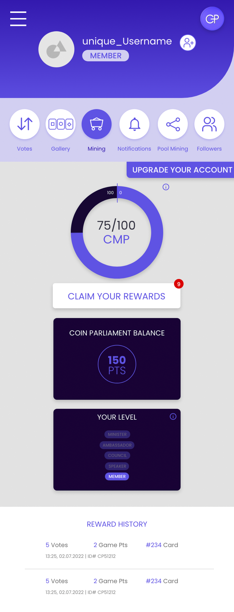
Mobile screens — voting flow, signal output, and user profile

What the work produced
A coherent participation and signal system — built to be trusted, readable, and scalable as the platform grows.
Clear model for participation and signal interpretation established — users have a consistent mental model for what they're doing and what the results mean, across mobile and web.
Standardized language and states reduce ambiguity — a single vocabulary for all signal states eliminates the misreads that undermine signal credibility.
Reusable interaction patterns built for scale — the pattern system supports content and user growth without requiring redesign as the platform expands.
Trust signals embedded in visual design — the predictability and consistency of the interface itself functions as a credibility signal, independent of platform reputation.